
Responsive Web Design
Ensure a seamless user experience across multiple devices
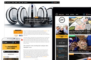
Ozy
The US-based media site launched in September 2013, founded by former MSNBC anchor Carlos Watson and Goldman Sachs colleague Samir Rao.
- Previous
- Next
-

Ozy
The US-based media site launched in September 2013, founded by former MSNBC anchor Carlos Watson and Goldman Sachs colleague Samir Rao.
-

DataCenter Dynamics
Powered by Webvision CMS and ADvance, and utilising responsive web design, the site offers an optimised mobile-first experience across all devices.
-

The Pharmaceutical Journal
Using our Webvision and ADvance platforms and utilising responsive web design, the site offers an optimised user experience for Royal Pharmaceutical Society members across all devices.
-

Retail Week Guides
Long-form journalism is a new style of in-depth, interactive content pieces comprising multimedia, video footage, high definition photography, data and infographics, and rich editorial content.
-

Investment & Pensions Europe
The site has been developed with a ‘mobile first’ approach, providing an optimized user experience across a number of different devices, responding to the screen size of each.
-

International Financial Review
Thomson Reuters re-launched the IFRe website for their weekly magazine with a fully responsive design using Abacus’ marketing-leading CMS.
- Previous
- Next
2014 saw mobile usage overtake desktop for the first time, and this trend will only continue with the increasing use of smartphones, tablets and even wearable technology. At the same time Google has announced that it will reduce the rankings of sites which are not optimised for mobile access. The rapid expansion of the mobile web posts a major change in the way your audience engages with your brand and content.
Key Benefits
- Reduce overhead costs by being able to publish content once without the risk of duplication, having only to maintain one URL
- Improve audience engagement web stats such as increased sessions, pageviews, average length of sessions and reduce the overall bounce rate
- Improve SEO and search engine ranking, and increase overall reach
- Provide a seamless user experience for the customer that automatically responds to the device they are using, eliminating barriers and making it easier for them to locate what they want to find and do business with your brand
- Future proof your business by staying one step ahead of your competition
Users expect a seamless web experience regardless of when, where and with whatever device they access your site. If your website is not optimised for mobile, you will be alienating potential customers/members and causing them to look elsewhere for the information and services they need.
Responsive Web Design (RWD) makes it possible to design a website which is able to recognise the screen size of the user, and to render its pages in the most appropriate format for the respective viewing device regardless of orientation. Responsive technology means that it is no longer necessary to build bespoke sites for mobile devices.
The Webvision UX development starts with smartphone, making sure the page works at its smallest resolution, and then moves through four increasingly larger profiles, moving elements, while expanding navigation and the potential number of columns. Adopting a ‘mobile-first’ business approach puts your audience at the heart of your organisation by providing them with an optimized and continuous user experience across a number of different devices.
Return on Investment
- Increase subscription revenue by increasing your potential reach, acquisition and retention rates
- Increase m-commerce conversion rates – transform the renewal and purchasing process to make it easier for users to register and buy products online
- Increase online advertising revenue by targeting the right audience with the right ad medium at the right time
The Webvision CMS ships with a full set of responsive web pages and templates that make it easy for users to consume the content they love on any device and wherever located. This allows editors to deliver quality content to their audience regardless of the viewing device, and the flexibility stretches beyond the pure content pages to the key elements of digital interaction, the online registration, subscription and e-commerce pages.
Today in 2017, RWD is no longer a nice-to-have but a necessity.
Now this strategy has been vindicated by the expert’s expert. During Marcotte’s weekly podcast he described Ozy as ‘a beautiful piece of responsive work’ with a design that ‘just feels at home on pretty much small or big screen’
Responsive Design Stats
”40% of people will choose another result if it is not mobile friendly” - Skillcrush
”70% of mobile searches lead to action on websites within one hour” - Iacquire
”85% of adults think that a company’s mobile website should be as good as or better than their desktop website” - Seocial
“90% of people use multiple device screens sequentially” - Seocial
