

Responsive design
The rise of smartphone and tablet usage has meant that your customers now expect a consistent user experience between these devices and the full desktop website. More often than not, the smartphone or tablet version is limited to a set number of pages like sections and stories with very little useful functionality, fiddly navigation and no touch gestures (such as swiping), which users expect on touchscreen devices.
Mobile commerce is largely overlooked entirely, meaning you are putting a barrier in front of potential online purchasing opportunities when really you should be doing everything possible to make it easy and intuitive to buy from you. This leaves your customers frustrated by a poor online experience which is damaging to your brand and devalues the capacity of the services you provide.
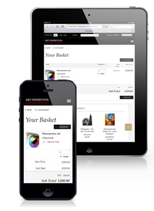
Responsive design
With Responsive Web Design it is now possible to run one website that adapts beautifully to the device type and screen size, providing your customers with unrestricted access to the content they desire, and an easy and effortless experience without doubling (or tripling) the production and maintenance effort of your site.
